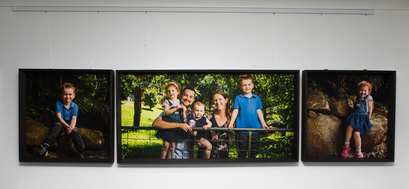
A gallery wall works when it has one anchor piece large enough to lead the eye, two or three supporting pieces that step down in size around it, and even spacing between every piece, roughly two to four inches wall to wall. Start with your biggest portrait and build outward from it. Don't choose four or five prints in the same size and hope they land as a group once they're on the wall. The families who get this right at the design appointment aren't the ones who chose the most artwork. They're the ones who thought about the wall as one composition before they picked a single size.
Start with the anchor piece
Every gallery wall needs a piece that's doing the most work, the one your eye goes to first. On a loungeroom wall above a sofa, that's usually the largest canvas in the group, often the portrait with the strongest single face or the whole family together. Choose that piece before you choose anything else. Once it's picked, its size and position set the scale for the entire wall, and every other decision follows from it rather than fighting it.
This is also why we talk about sizing at the consultation rather than after the session. The anchor piece needs to suit the wall it's going on, not just be whichever portrait you love most. A wall with a low ceiling or a narrow run between two doorways calls for a different anchor than a long, uninterrupted expanse above a hallway console. If you haven't worked through how size and wall actually relate, our guide on choosing the right wall art size walks through it properly.
Let the rest step down from there
Once the anchor is set, the supporting pieces should be smaller, and ideally more than one size smaller so there's a visible hierarchy rather than two competing halves. A common, reliable pattern is one large anchor, two medium pieces either side or below it, and one or two small pieces filling the remaining corners. The small pieces are where individual portraits or a couple's piece can sit, doing quieter work while the anchor carries the wall.
Resist the urge to make everything roughly equal in size because it feels fairer to each portrait. A wall of near-identical sizes reads as a grid, which is a very different, more formal effect, and it only works if that's genuinely the look you're after. For most family walls, the stepped-down approach feels more natural and more like a considered display than a set of matching frames.
Spacing is what actually holds it together
Size and hierarchy get most of the attention, but spacing is what makes a group of pieces read as one wall rather than a scatter of separate frames. Keep the gap between every piece consistent, generally two to four inches, and hold that gap all the way around the group, not just between the two you hung first. Inconsistent spacing is the single most common reason a gallery wall looks unplanned even when the individual pieces are beautiful.
It also helps to think about the wall's edges the same way you'd think about a page margin. Leave breathing room around the whole group rather than letting it run edge to edge or crowd right up against a doorframe or light switch. A gallery wall with generous white space around it looks intentional. One that's been squeezed to fit looks like an afterthought.
Mixing sizes without it turning chaotic
Mixing sizes is what gives a gallery wall its life, but it only works with a rule underneath it. The simplest one is to use no more than three distinct sizes across the group, so your eye can still sort pieces into large, medium and small at a glance. Too many different sizes and the wall starts to feel busy rather than layered.
Orientation matters just as much as size. A wall of all-portrait or all-landscape pieces feels calmer than one that mixes both freely, so if you're combining a family group shot with individual portraits, it's worth deciding early which orientation will dominate and letting the other sit in a supporting role.
Why a Wall Art Collection already has this solved
This is exactly the problem our Wall Art Collections are built to solve. Each collection, Belvedere, Casterly Rock, Dragonstone, Highgarden and Winterfell among them, is designed as a set from the outset, with sizes, proportions and spacing already worked out so the pieces read as one wall the moment they're hung. You're not solving the anchor-and-hierarchy problem yourself from a blank wall. It's already solved in the collection you choose. Our guide to Wall Art Collections goes through what's in each one and how they're priced.
A gallery wall that holds together isn't about how many pieces you choose. It's about whether they were planned as one wall or picked one at a time.
Photograph your wall before the design appointment
The single most useful thing you can do before the design appointment is to take a photo of the actual wall you're planning for, with the light switches, doorframes, furniture and any trim visible. It means we're planning against your real space rather than an imagined one, and it lets us talk you through exactly how an anchor piece and its supporting pieces will sit on that wall before anything is ordered. If you're planning the wall above a sofa or console, our guide on displaying portraits in the loungeroom covers height and placement in more depth.
Bring that photo to the appointment, along with a sense of which portraits from the session mean the most to you. We'll do the sizing and layout work together from there, against the wall you actually have.
Every portrait begins with a conversation at the Belgrave gallery.